
Photo by Kate Pearce
We're delighted to be able to chat with three H&W customers about their projects using our Schoolhouse wallpaper collection. Kate Pearce of Kate Pearce Vintage, designer Ann Lacouture, and Alexis Cosinuke of Maddox in the Middle each used wallpaper in unique and inspiring ways.

Photo by Ann Lacouture
Designer: Ann Lacouture
About Ann: Although she has a degree in Statistics, Anne has always been passionate about interior design. Her style? Feminine Preppy. It's transitional, eclectic, colorful but balanced, not cluttered, but not minimal. As a mother of four kids, simply joys are found in wallpaper and a dinner someone else has made.

Why did you choose Cascade Meadow (Juniper) for this bathroom?
Oh goodness. How could anyone NOT choose it? I’ve never had a “love at first sight” experience until I saw Cascade Meadow on Natalie Papier’s bathroom ceiling. I had to have it! My home already incorporates shades of greens and blues all over, and all of our exterior doors are yellow, so I felt like this paper was just MADE for me! The light periwinkle blue in the paper is almost the exact color of the duvet cover in my bedroom; and my adjoining bathroom had good bones but had been missing some drama and impact since we moved in. So I knew this paper would be perfect in there!

Photo by Ann Lacouture
Design considerations: I knew any wall covering in our bathroom would need to be cool in tone, to balance the warmth of the wood of our vanity. I also wanted it to have a darker background color to contrast the white trim of the windows and the white quartz counter top. Finally, I wanted it to incorporate at least one of the colors in my adjoining bedroom. This paper checked all the boxes! I always like to balance bold color and pattern with plenty of white and plenty of light. My soul needs color and pattern to be happy and inspired. My mind needs white space and light to be able to breathe.
Designer: Kate Pearce
About Kate: Kate's background is in Art History, and she fell into design accidentally. While selling art and vintage pieces, she started to get features for her interior work, and from there it morphed organically into a full-blown career. Kate's design aesthetic is ECLECTIC. The challenge and fun in her work is in creating unexpected color palettes and pattern mixes together, while also marrying pieces from different time periods in a cohesive fashion - vintage, color, and pattern are all at the heart of her designs.

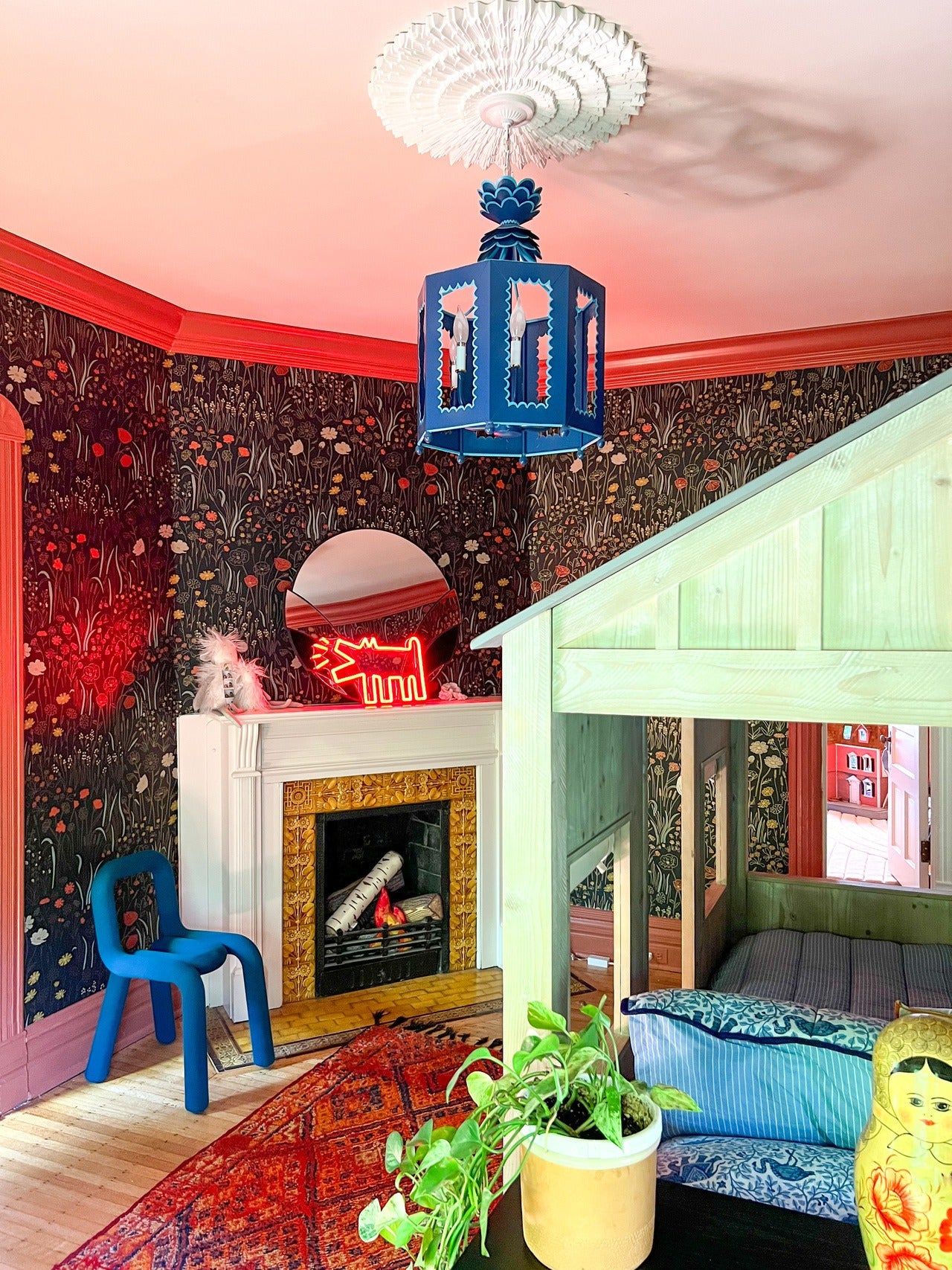
Photo by Kate Pearce
Why did you choose Alpine Garden Multi (Ebony) wallpaper? I wanted my daughter to be involved in the process, and so I whittled a list of about 50 wallpapers she picked out down to five and gave her the choice. I was silently relieved she chose the Alpine Garden because it was my favorite, too. My daughter has a very gender-neutral style and preferences and I loved that this wallpaper didn't feel overly gendered. The color combinations in the paper were so unexpected, and really served as a jumping-off point for the rest of the room. And I absolutely adored the metallic finish, which added just the right touch of fun for a kids' room but could just as easily read as fancy for a more sophisticated space. The main considerations for this space were paying homage to the 123 year-old home in which it lays, and to make sure it was a space my daughter was excited to be in. The Alpine Garden wallpaper has such a timeless feel to it that I knew would fit right in with the room's antique architecture. The colors were perfect to spark my daughter's endless imagination, and served as the basis for us to bring many other whimsical elements into the room.
Design considerations: Working with a bold wallpaper can be intimidating to a lot of people, but really it makes the entire creative process easier. There is so much inspiration to be taken from a bold paper such as the Alpine Garden. It sets the tone for the room; in color, pattern and style. I took the muddy red out of the wallpaper and painted the trim a very similar color. I chose red because it is my daughter's favorite color, and I wanted to have some fun with the trim since it is a child's room. The rug and the wallpaper both have a very bohemian feel and complementary color patterns, which allows them to work together while still being quite different. One other tip I would leave as far as creating a color palette for a room based off of a wallpaper is this: when taking colors from the wallpaper to use throughout the room, don't match the colors exactly. If they are warm blues, for example, use a warm blue that is close, but does not exactly match the color in the wallpaper. This helps give the room dimension, while also keeping it cohesive.

Designer: Alexis Cosinuke
About Alexis: Alexis worked as an interior designer for a residential firm in Cincinnati. But when her husband's job relocated the family, she made the transition to helping design clients virtually and being a stay at home mom to her three children. She has a strong appreciation for so many design aesthetics and tends to incorporate several aesthetics into every design. Adding vintage elements is always a priority as it adds both charm and character. If she had to describe my aesthetic? Vintage Traditional. In her own own, she had designed spaces that inspire creativity, induce comfort, and create memories.

Why did you choose Woven (Parchment) wallpaper for this room?